If you have multiple companies or multiple branches set up in your Acumatica system, have you ever entered data in the wrong place? During a busy workday, it is an easy mistake to make.
A new feature in Acumatica 2019 R1 is about to make your day a bit easier. It is called “Custom Color for User Interface” and it allows you to personalize the primary color of your system.
Pretty colors are nice but there is a lot more value behind this. That is the ability to easily differentiate between companies and branches. Acumatica heard customer feedback that there were data entry issues when users were not easily able to recognize which company they were working in.
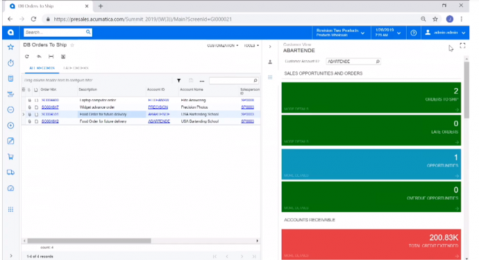
At Acumatica Summit this example was shown.
The first screenshot shows the traditional blue color theme. (Note: this has been called “Patriots blue” because we all know Acumatica’s CEO, Jon Roskill, loves the Boston Patriots).

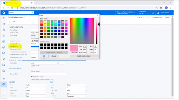
In the “Site Preferences” screen you can select a new color in the “Primary Color” field.

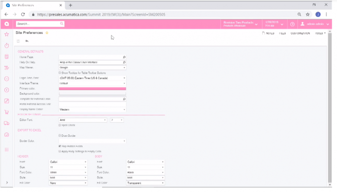
The result is that the color theme of this user interface has changed to the new color you selected. In this case, pink. So you would quickly know from the color, that you are working in the “California Branch” versus the “Boston Branch” for example.

Sometimes the simple changes have the most impact. That type of quick differentiation from a visual standpoint should help you to reduce errors and be more efficient.
For more tips visit https://www.calszone.com/category/blog/acumatica/acumatica-tips/
Learn more about Acumatica Cloud ERP
If you are evaluating a new ERP system, or are already using Acumatica contact CAL Business Solutions. 860-485-0910 x4 or sales@calszone.com
By CAL Business Solutions, Acumatica and Microsoft Dynamics GP Partner, www.calszone.com
Follow us on Twitter: @CALERPNEWS


